Did you know that the first impression of something takes place within 90 seconds of the initial look, and between 62% and 90% of that assessment depends solely on color? It shouldn’t be an overstatement to say how important color is for establishing a visual identity. Color helps us perceive images more efficiently than colorless scenes.
Bright colors can provoke happy feelings, while darker colors evoke more negative emotions – but that’s an already well-known fact, wouldn’t you agree? Our job is to examine this concept in more detail.
Color Theory
Let’s briefly overview the fundamentals of color theory. It mainly describes how humans perceive colors. Color theory creates a logical structure for color. People cannot process every object at a first glance. Therefore, color has to be used as a tool to emphasize main areas that instantly grab the audience’s attention.
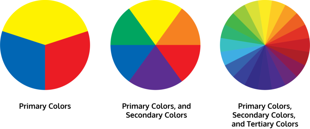
In color theory, colors are organized on a color wheel and grouped into 3 categories: primary colors (red, yellow, and blue); secondary color (the result of mixing primary colors: green, orange, purple), and tertiary colors (colors created by blending primary and secondary colors, such as red-violet)
Colors and emotions
Stop for a minute and think about your favorite color…..
Is it a vibrant yellow? Calming green? Energetic Red? Sophisticated Black?….. How does picturing that color make you feel?
We might perceive colors differently, but let me suggest some of the most common emotion associations :
- Red – is attractive and powerful. It’s connected to excitement, energy, passion, love, desire, speed….
- Orange – It is known to promote positive thinking, energy, balance, enthusiasm, warmth…
- Yellow – signifies joy , creativity, idealism, imagination, hope, sunshine…
- Green – symbolizes prosperity. It also invokes trust along with good luck, environment, youth and health.
- Blue – is a conservative colour, and is known to have a calming effect.
- Black – is associated with formality, elegance, remorse, death (mostly in Western cultures), fear…..
- Purple – is rather a noble color. It’s generally related to royalty, wisdom, enlightenment…
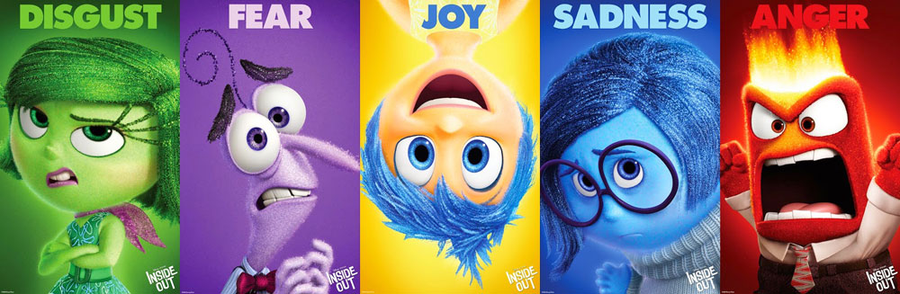
Fun fact: Did you know that in Disney/Pixar’s 2015 animation Inside Out, the creators used the psychological perception of colors while creating characters: yellow for Joy, blue for Sadness, red for Anger, green for Disgust and purple for Fear.
How important is the color palette in illustrations?
Tremendously! If used correctly, color can pull some strong visual punches that will take an illustration from simple to complex.
Using cool tone colors is effective whilst illustrating the environment, it helps with highlighting temperature. In this illustration, we used colder textures to emphasize that the action in the scene was taking place during the winter.

Generally, harmonious yet still impactful color treatment is a way to go with. Using lots of colors on a piece of work can be amazingly effective. However, to prevent it from becoming confusing to look at, it’s a good idea to control how much harmony these colors are with each other. One way to avoid this is to stick to, say, three or so colors and use the rest in smaller amounts to add details and engage the eye. The result is colorful work that isn’t difficult to digest.

Final take-aways
- Color and emotion are tied closely. Understanding the meaning behind every color is a vital part in the illustration.
- Color trends are set by color experts based on research and forecasted consumer preferences.
- Consider the industry. Are there positives and negatives associated with specific colors?
- Always go for colors that effectively communicate the message of your art piece.
Even though I have listed some general ideas about colors and their role, it’s still a subjective topic and nevertheless -it’s in the eye of the beholder!